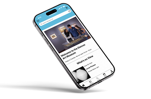
Museum.IO – Enhancing the Museum Experience Through Mobile Engagement
A mobile concept that educates patrons, deepens engagement, and modernizes museum visits with QR codes, social features, and seamless gift shop integration.

Overview
Museum.IO is a mobile app concept that bridges the gap between traditional museum visits and modern digital expectations.
By allowing patrons to scan exhibit QR codes, explore artwork stories, save favorites, and shop artist-related products, the app transforms passive viewing into active discovery.
Timeline
6 weeks
Role
UX/UI Designer (solo)
Tools
Figma, Adobe Illustrator
The Challenge
Museum-goers often crave more context about the artwork they view—but audio tours feel outdated, and printed plaques are limited.
Museums also struggle with visitor retention, limited personalization, and underperforming gift shops.
The opportunity: Use mobile technology to create a personalized, connected experience that benefits both users and institutions.
My Role
I led this self-directed concept through a full UX design cycle—from research and ideation to prototyping and interaction design.
Responsibilities:
Conducted user interviews and competitive analysis
Defined user personas and journey maps
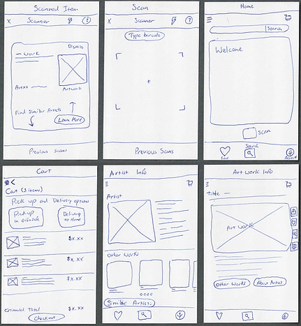
Ideated and wireframed key flows
Designed a full prototype in Figma
Created micro-interactions and visual design system

Process Breakdown
1. Discovery
I interviewed 5 frequent museum-goers (ages 25–50) and reviewed existing apps (like Smartify and Google Arts & Culture) to find UX gaps.
Key insights:
-
Users want quick access to info without bulky hardware
-
QR code scanning felt familiar and convenient
-
People rarely remember artworks they saw after leaving
-
Museums lose potential post-visit engagement and e-commerce revenue
2. Define
From my research, I created two core personas:
“The Curious Visitor” – loves stories and art history
“The Social Explorer” – wants to share discoveries with friends
I mapped out their journey before, during, and after a museum visit.

3. Design
I began with sketching core flows, then moved into wireframes and finally high-fidelity mockups. My goal was to keep the interface elegant and non-distracting—enhancing, not replacing, the physical experience.
Core features:
-
QR scan to reveal artist info + video/audio options
-
Favorite and save artwork to revisit later
-
Shareable artwork pages with friend tagging
-
Gift shop integration for print/delivery purchase
-
Onboarding and accessibility features

4. Prototype & Interaction
I designed and prototyped flows in Figma to simulate core actions:
Scanning artwork
Saving pieces to profile
Checking out through the integrated gift shop
I paid special attention to motion, hierarchy, and typographic clarity to maintain a refined feel.
.png)

Outcome
Although this is a concept project, it showcases how mobile UX can bridge physical experiences with digital depth. I’ve since shared it with two local museums and received strong interest in future collaboration.
Results:
-
Completed fully clickable prototype in under 6 weeks
-
Built flexible design system for future scaling
-
Earned positive feedback from 3 design mentors and museum staff
-
Used as a lead project in job interviews for UX positions
What I Learned
I learned how to translate physical behaviors (like pausing at a painting) into intuitive digital interactions.
It deepened my empathy for casual users navigating public spaces and challenged me to design for discovery, not distraction.