UX/UI DESIGNER & DEVELOPER
THINK ANALOG WORK DIGITAL
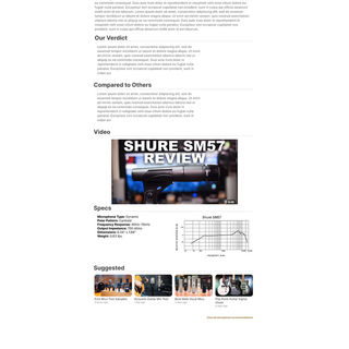
"Think Analog Work Digital" is a resource hub designed to empower aspiring musicians, producers, and engineers with high-quality, actionable information on recording music. The site offers gear reviews, interviews, how-to lessons, and curated links to the best prices on essential equipment—all in one place. My mission was to create a site that was not only informative, but also intuitive, inspiring, and easy to navigate.

THE APPROACH
As the sole creator, I led every phase of this project—from ideation and research to design and development. I:
-
Conducted extensive user research with over 100 musicians and engineers.
-
Designed all wireframes, UI mockups, and high-fidelity prototypes using Figma.
-
Created custom branding assets in Photoshop.
-
Developed the entire site from scratch with a strong focus on performance, function, and responsiveness.

THE PROCESS
Discovery
I surveyed over 100 users in niche Facebook groups for musicians and audio engineers. I asked what they felt was missing from similar websites and what features they’d most value. Common themes included a desire for:
-
Clear, unbiased gear reviews
-
Easy navigation across a wide range of content
-
Curated purchase links to avoid endless Googling
-
Real-world techniques from credible engineers
Design
I began with hand-drawn notecard sketches to quickly test layout concepts, then moved to Figma for structured wireframes and UI prototyping. The visual branding was also developed by me, aiming for a clean, modern, yet “analog-inspired” aesthetic that reflects the blend of classic and digital recording techniques.
Testing
I conducted user testing with a second group of beta testers from similar Facebook groups. Their feedback helped me fine-tune the navigation structure and simplify some dense content areas.
Iteration
Although most feedback confirmed I was on the right track, it helped refine key UX decisions. For instance, I restructured the homepage layout to prioritize lesson content and simplified the gear review categories to avoid overwhelm.


THE CHALLENGES
One of the biggest challenges was balancing the sheer volume of information—gear, interviews, lessons, and links—without overwhelming users. My solution was a modular content structure with consistent visual cues and micro-interactions to guide users seamlessly through their journey.


